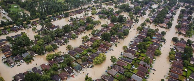
Hurricane Harvey was an extremely devastating storm that made landfall to Port Aransas and Port O’Connor, Texas, in the United States on August 24-25. The Artificial Intelligence for Digital Response (AIDR) technology, developed by the Qatar Computing Research Institute (part of Hamad Bin Khalifa University), collects and categorizes social media data in real time to assist rescuers direct resources to areas most in need during disasters.
AIDR collected more than 4 million Twitter messages during the hurricane. Of all the tweets, ~300k were found to have an image URL linked. However, more than 210k of these URLs were found as duplicates, leaving around 90k unique image URLs. Tweets posted from the disaster area are always deemed more useful than tweets from other areas. We found around 2,600 geo-tagged tweets in total, most of them posted from the US. AIDR employs state-of-the-art supervised machine learning techniques to automatically classify both textual and imagery content collected from Twitter.
To classify Harvey tweets, an AIDR classifier was trained (F1=0.64) using more than 30k human-tagged tweets collected from a number of past disasters. Figure 1 shows the distribution of AIDR automatic classification results using textual content of the collected tweets.
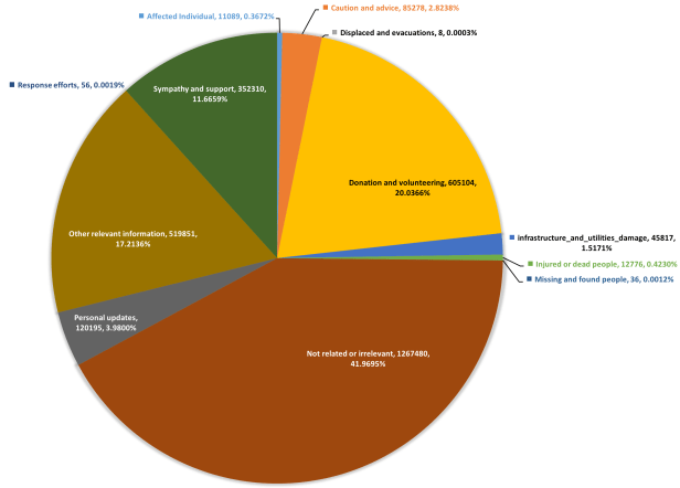
As expected, almost half of the tweets are not related or relevant, let alone useful, to disaster response. Among others, donation tweets including requests or offers of money, volunteering services of different kinds such as shelter, food, and other supplies, etc. have the highest prevalence, which is almost 20% of the whole data. Sympathies, thoughts, and prayers have been observed as one of the big chunks of social media messages during catastrophes and emergencies. As depicted, around 11% of this data is about sympathy and support. The other relevant information category, which includes important reports that do not belong to any of our specified categories but still are important for disaster response efforts in one way or another, is the second largest category with ~17% share.

Figure 2 shows the map of geo-tagged tweets from Florida, USA. According to the results obtained from the AIDR classifiers, both caution and advice and sympathy and support categories are more prominent than other informational categories such as donation and volunteering. Whereas, if we closely analyze Figure 3, which shows the map of geo-tagged tweets from Houston, TX, USA, clearly donation-related tweets are high in number compared to the tweets from Florida. We have also published a map of all the geo-tagged tweets classified by AIDR here: Harvey geo-tagged tweets map

In addition to the textual content processing of the collected tweets, AIDR’s automatic image processing pipeline was also deployed to collect and analyze imagery content posted on Twitter during Hurricane Harvey. For this purpose, we employ state-of-the-art deep learning techniques. One of the classifiers deployed in this case was our damage-level assessment. The damage-level assessment task aims to predict the level of damage in one out of three damage levels i.e., SEVERE damage, MILD damage, and NO damage.

Figure 4 shows the distribution of classes based on the damage-assessment classifier (F1=0.89) prediction results of ~90k images. Almost 86% of the images do not show any damage. Most of these images, among others, show advertisements, cartoons, banners, and other irrelevant content. Of the remaining set, 10% of the images contain MILD damage, and only ~4% of them show SEVERE damage. However, finding these 10% (MILD) or 4% (SEVERE) useful images is like finding a needle in a giant haystack. Artificial intelligence techniques such as employed by the AIDR platform are hugely useful to overcome such information overload issues and help decision-makers process large amounts of data in a timely manner. Figures 5, 6, 7, and 8 show the damage prediction results. We are amazed by the system’s performance. In most of the cases, the system perfectly predicts the level of damage shown in an image. Although some of our human annotators had difficulty distinguishing between MILD and SEVERE categories, the system results are not that bad. Clearly, images tagged as SEVERE show intense damage compared to the images tagged as MILD.
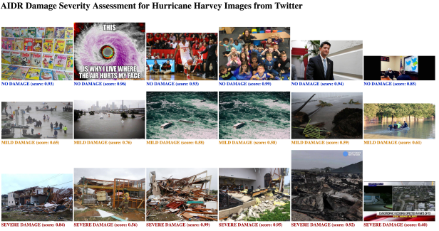
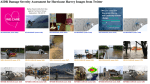

Image characteristics differ based on regional conditions, e.g., in some places buildings may be mostly made of bricks, whereas at others they may be made of wood. Consequently, the rubble after the damage in these different regions will look different. Therefore, the best results will always be obtained if we can also get labeled training data from the event. However, especially at the beginning of a disaster, such labeled data may not be readily available. However, this deployment does not show too many false positives, which is hopeful.
Although we’ve observed its good performance, the AIDR’s image processing pipeline is currently in its testing phase and there is a room for further improvements. However, the preliminary results obtained for Hurricane Harvey data have proved the potential of this early-stage technology. The data used in this analysis will soon be made available from our crisis data repository site at crisisnlp.qcri.org.
For more details regarding the science behind this technology, please refer to the following papers:
- Firoj Alam, Muhammad Imran, Ferda Ofli. Image4Act: Online Social Media Image Processing for Disaster Response. In Proceedings of the IEEE/ACM International Conference on Advances in Social Networks Analysis and Mining (ASONAM), 2017, Sydney, Australia.
- Dat Tien Nguyen, Ferda Ofli, Muhammad Imran, Prasenjit Mitra. Damage Assessment from Social Media Imagery Data During Disasters. In Proceedings of the IEEE/ACM International Conference on Advances in Social Networks Analysis and Mining (ASONAM), 2017, Sydney, Australia.
- Muhammad Imran, Carlos Castillo, Ji Lucas, Patrick Meier, and Sarah Vieweg. AIDR: Artificial Intelligence for Disaster Response. In Proc. of the 23rd International Conference on World Wide Web (WWW) Companion, 2014. Seoul, Korea.
